Charting, or technical analysis, is one of the most important yet misunderstood tools available to investors.
Charting is about understanding the behaviour of the market. Rather than focusing solely on what a company does or how much money it makes, charting focuses on what the overall market thinks about that company.
Charting graphically demonstrates to us the flow of money and the emotions of participants. It indicates to us where demand may increase and where it may fade.
When looking for an investment opportunity, most investors spend their time trying to find good businesses. Many investors will try to understand the fundamentals of the company. They may look at its Price Earning (PE) ratio, its earnings growth, return on equity and so on.
However, at Fairmont Equities, we believe that very few investors put equal effort into understanding when to buy and when to sell. That is where charting can potentially help.
We regard charting as a crucial extra tool in our tool belt – one that many may dismiss as being for “traders” only.
What a chart can tell us
When we look at a share price chart, we are looking at the direction of where money is flowing in a stock. That is, do we see buying pressure or selling pressure? We are also looking at human psychology and emotion.
The movements that a share price makes in a given timeframe can reveal much about the level of buying or selling. Are we seeing large moves on large volume in the stock? Are we seeing a suppressed share price with minimal participation? The way share prices can find buyers or sellers around particular price points can also be quite revealing to the investor.
The potential benefit of using charting is that it may help us understand whether a stock is experiencing buying support or if it may be suffering from any major selling pressure.
This is important for two reasons. First, because if we have an indication what direction a share price is heading in, we may improve our buy or sell levels. Any small gain that we can achieve in our buy or sell price can compound over many trades, over time.
The second benefit is that charting may help us identify when a stock is not behaving the way it should. Often a stock will move in the opposite direction to what you expect. The question is whether it is the market that has it wrong, or is our analysis wrong instead?
As investors, we may believe we are correct about a company, but if the weight of the market looks like it is heading in the opposite direction, then we may be taken with it. Used well, charting may help us understand where the tide is heading.
If large funds and institutions are selling a stock, then as investors we are perhaps better off not buying in just yet.
Conversely, if we cannot see yet why a stock price should be heading higher but there are clearly large amounts of money flowing into it, then perhaps we are better off not selling just yet.
At Fairmont Equities, we have seen examples of shares where, at face value, one would not expect the price to continue in a certain direction. However observing that flow of money has kept us in the position for a while longer.
Understanding charting
The first step to understanding charting is to know that every stock can move through four distinct phases: accumulation, uptrend, distribution, and downtrend.
During accumulation, the ‘smart money’ quietly enters positions while the broader market is still pessimistic. This is often characterised as a share price that moves sideways for a period, even though most fundamental analysis suggests that it should be heading lower.
As demand builds, the stock moves into an uptrend, characterised by higher peaks and higher troughs on its share price chart.
Good news starts to flow through, and investors notice that the share price is heading higher. Eventually, the rest of the market catches on to this latest stock opportunity and this could further fuel the uptrend.
However, at some point the smart money begins to sell into the price strength to take advantage of this extra liquidity that is created by these new buyers. This creates the distribution phase and can be characterised by a levelling out in a share price when most investors would expect it to head higher.
Any dips in the company’s share price are bought by investors, but the stock’s rally is not sustained. This is because professional investors use the rally in the share price to sell their stock in the company at a higher price. Finally, when the last of the optimistic buyers are finished, the stock starts to fall again.
Buying in the wrong phase
In Fairmont Equities’ view, investors can struggle because they may buy during the wrong phases —usually the distribution or downtrend—when the probability of success is lowest.
Most companies report their earnings only twice a year. This means that by the time the fundamental-only investor has waited for the next earnings result to find out how the company is tracking, the share price may have already been trending lower for a while.
By recognising these phases on a chart, we can focus on buying when a stock looks likes it is heading higher. Not only that, but we can focus on knowing when to sell a position. This is particularly important because at Fairmont Equities, we have anecdotally found that investors’ number one problem is knowing when to sell a stock.
Key risks
The risk of charting is that it is not an exact science. Just like looking at a stock’s fundamentals, we cannot predict the future, and we need to make assumptions along the way.
When investors begin using charts, one of the key skills to develop is the ability to interpret price movements - such as recognizing whether a dip in a share price is merely a short-term fluctuation or the beginning of a more serious decline. For chartists, this is a constant challenge. Every market correction starts with a down day, but not every down day signals a correction.
As one gets better at charting, it becomes easier to tell the difference, but we are always dealing with probabilities and stocks can head in the opposite direction to what we expect through charting analysis.
What the charts say about global equity indices
Now that we understand the basic concepts of charting and the four different phases, what do the charts tell us about some of the major global indices: the S&P/ASX 200, S&P 500, FTSE 100, and Hang Seng?
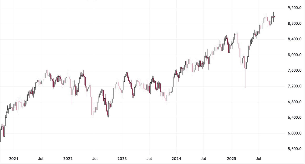
1. S&P/ASX 200
The Australian market has been trending higher since the start of 2024. Most pullbacks have been shallow, which Fairmont Equities regards as a good sign because markets need to take a breather every now and then. This means that the uptrend might be sustainable. In Fairmount Equities’ view, based on the charts, the probability for now is that the S&P/ASX 200 may continue to head higher for a while yet.
Chart 1: Australian equities - S&P/ASX 200 Index

Source: Tradingview.com - 2021 - July 2025
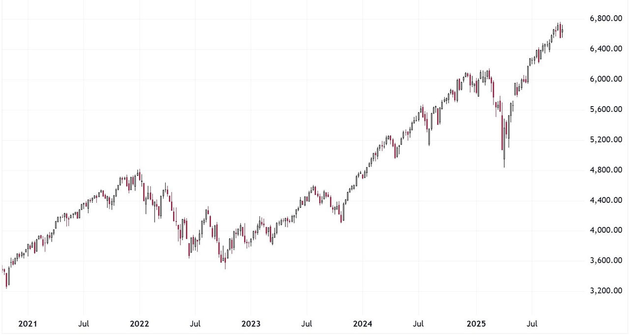
2. US equities - S&P 500 Index
This index has been in an uptrend since late 2022. It briefly broke the uptrend in April of this year, but the uptrend quickly re-established itself. Volatility has been low, and Fairmont Equities regards this as a good sign for the market. There may be periods where volatility spikes higher and the index might pull back. Fairmount Equities has not observed any major or obvious signs that the uptrend is under threat (although this may change in the future).
Chart 2: S&P 500 Index

Source: Tradingview.com - 2021 - July 2025
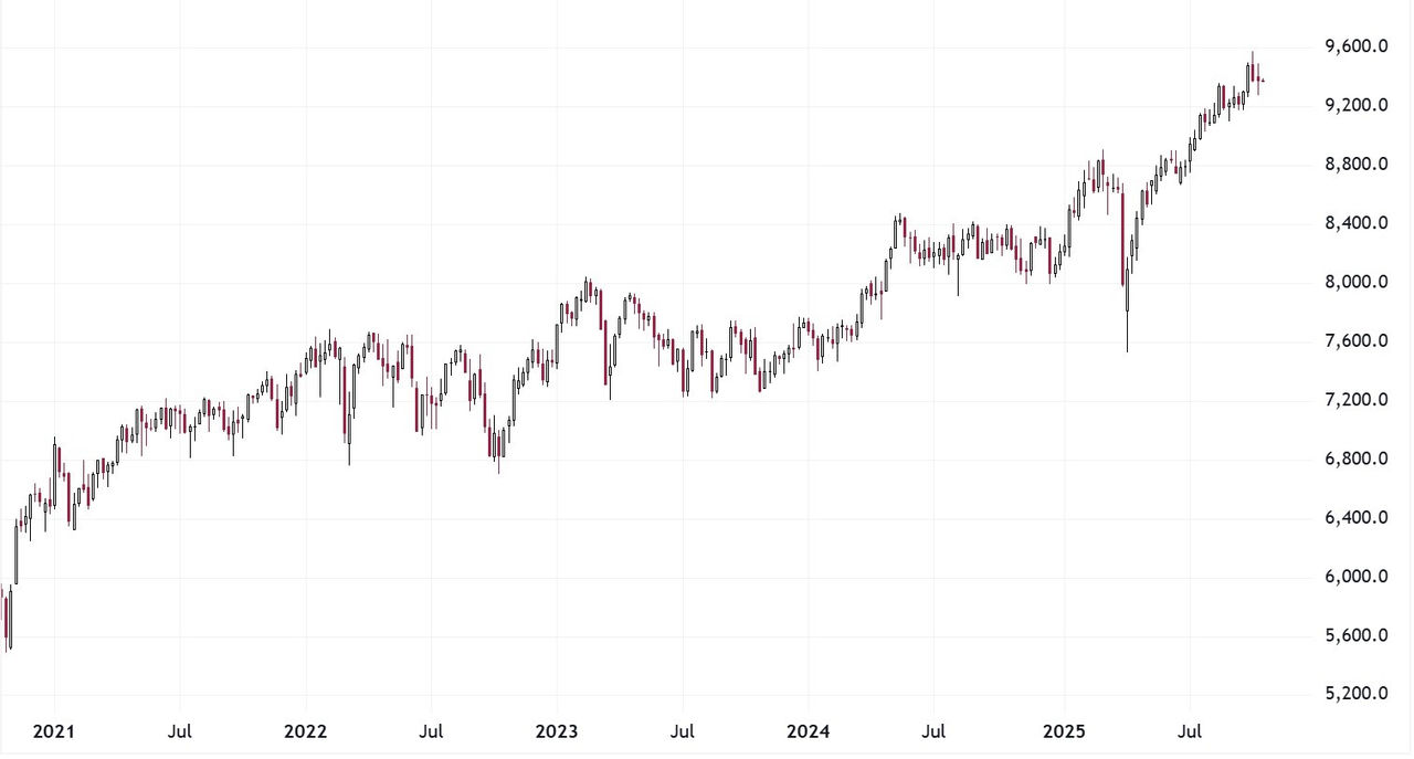
3. UK equities – FTSE 100 Index
The FTSE, for now, remains in an uptrend. However, this uptrend only commenced at the start of 2025. Unlike the S&P 500, the FTSE tends to display more volatility, and its trend will typically pause for longer periods. This can make it harder for investors to understand whether the uptrend is being threatened or not.
Chart 3: FTSE 100 Index

Source: Tradingview.com - 2021 - July 2025
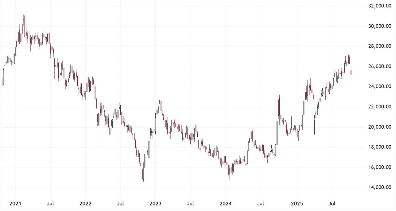
4. Chinese equities (Hong Kong) - Hang Seng Index
In comparison to the indices described above, the Hang Seng has a lot more volatility. The dip in 2022 saw the index break under the COVID-19 low and the rebound since then has seen many deep pullbacks along the way. This is an index that chartists will find hard to understand whether pullbacks along the way are just short-term dips or have potential to lead to larger corrections. At the moment the index appears to be in a long-term uptrend, but this could change quickly.
Chart 4: Hang Seng Index

Source: Tradingview.com - 2021 - July 2025
From ASX
Our company pages, found via the company directory, include an advanced charting tool where you can apply your 'Technical Analysis' to create your own charts, comparing company codes, price and index data.
DISCLAIMER
Fairmont Equities Australia (ACN 615 592 802) holds an Australian Financial Services Licence (AFSL 494022). The information contained in this article is general information only. This article should not be interpreted as one that provides personal financial or investment advice. Any examples presented are for illustration purposes only. Past performance is not a reliable indicator of future performance. No person, persons or organisation should invest monies or take action on the reliance of the material contained in this article, but instead should satisfy themselves independently (whether by expert advice or others) of the appropriateness of any such action. Fairmont Equities Australia, it directors and/or officers accept no responsibility for the accuracy, completeness or timeliness of the information contained in the report.
More Investor Update articles
Don’t miss the latest insights from ASX Investor Update on LinkedIn
The views, opinions or recommendations of the author in this article are solely those of the author and do not in any way reflect the views, opinions, recommendations, of ASX Limited ABN 98 008 624 691 and its related bodies corporate (“ASX”). ASX makes no representation or warranty with respect to the accuracy, completeness or currency of the content. The content is for educational purposes only and does not constitute financial advice. Independent advice should be obtained from an Australian financial services licensee before making investment decisions. To the extent permitted by law, ASX excludes all liability for any loss or damage arising in any way due to or in connection with the publication of this article, including by way of negligence.
